Dashboards
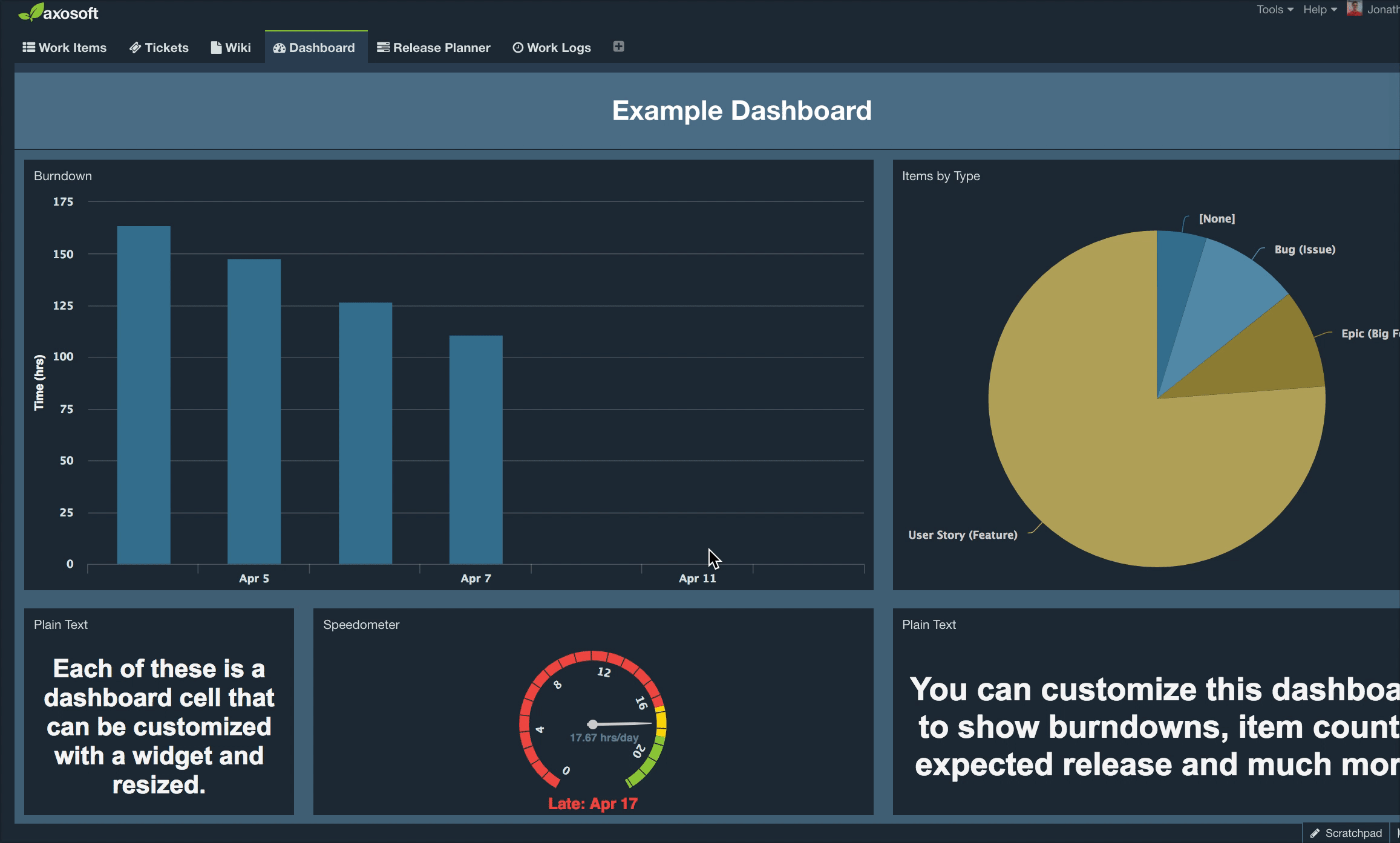
The Axosoft Dashboard allows you to create visualizations of your Axosoft item information and is great for users, project managers, or anyone interested in overviews of Axosoft information. It allows for 5 different chart types to be dragged and dropped right onto the dashboard, as well as each individual chart can be customized to report on the data you want to view or analyze.
Dashboard toolbar
- Click on the add button in the dashboard toolbar to add new gadgets to the dashboard.
- Click on the gear button to access more options and change dashboard settings.
- Click on the name of the dashboard at the top to create a new dashboard or switch between dashboards.
- Click on the hyperlink button to access and copy the public dashboard link.
- Click on the arrow button in the upper right to pop the dashboard into another window.

Dashboard gadgets
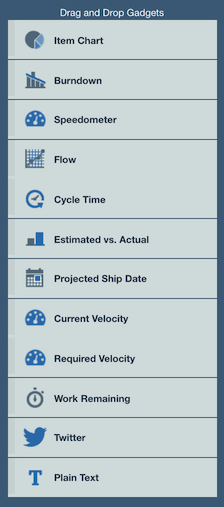
Once a gadget is added to a dashboard you can drag and drop it to move, or drag any of the edges to resize.
The Item Chart allows you to visualize different data sets, making it one of the most flexible gadgets. Scroll down to learn more.
The Burndown is our flagship gadget that condenses your release's progress in one visual chart. For detailed information about the burndown chart, please review Burndown Charts.
The Speedometer displays the velocity and projected ship date of the selected release. The green section of the speedometer is based of the release's Required Velocity.
Flow and Cycle Time both provide visual data about items based of status or workflow step. Scroll down for more information.
The Estimated vs. Actual gadget displays a bar chart comparing the estimated work for each item with actual work done, which is great for sprint retrospective meetings and reviewing past work.
The Projected Ship Date shows the date Axosoft predicts you will finish all work assigned to the release. This is the same projected ship date shown in the speedometer.
The Current Velocity displays how fast work is getting done for the selected release. This will match the release's burndown velocity.
The Required Velocity shows you how fast your team needs to complete work to make the selected release's due date.
The Work Remaining sums all the remaining estimates for items assigned to the selected release.
The Twitter gadget allows you to retrieve and display up-to-date tweet data from Twitter.
The Plain Text gadget adds any text information to your dashboard.
No Due Date: If the selected release does not have both a Start Date and Due Date, you may see the No Due Date message in your Speedometer, Required Velocity, or Current Velocity gadgets.
Entering a value for the Due Date field by right-clicking the release from the Organize Panel or by accessing the release from the Release Planner should fix the issue.
Item Chart gadget
Probably the most powerful gadget available for your dashboard is Item Chart, where you can filter to create a chart for any items in a particular project or release, or use any of your custom filters.
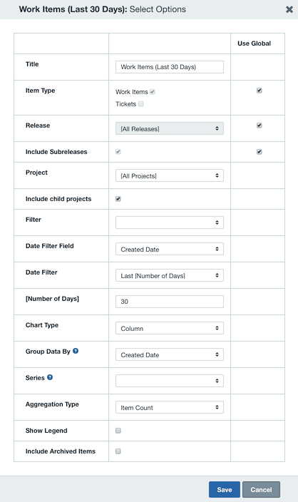
To group by different fields select the option under Group Data By. Select the Aggregation Type to select from a count of items, or total of Initial Estimate, Remaining Estimate, or Actual Duration.
You can drill down for secondary categorization by adding Series to your grouped data.
Selecting an Aggregation Type of Sum or Average instead of Item Count will display Rate options. This is a multiplier, and it will come in handy if you wish to apply it as a flat bill rate value to include in the chart's display.
You can also select between different chart/graph types like column, pie, bar, line, and area to change how the data is displayed.
One very helpful gadget is to show current user workload. For this, Group Data By the Assigned To field and for Aggregation Type select Remaining Estimate.
Cycle Time gadget
The Cycle Time gadget allows you to review how long on average items stay in any given Status or Workflow Step. The gadget lists the selected dataset on the X axis and hours on the Y Axis. By default, you can group by the Assigned To field however you can easily choose other groupings or chart types.
In the example below, each Status is shaded a unique color and you may hover over each section to review its average cycle time and more.
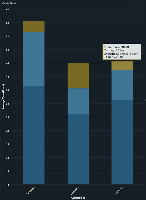
How to read tooltip
- Name of user
- A typical item in your workflow/statuses spends this much time here
- Of the items that have been moved to this step or status, they are here for this much time and here is the number of items that have ever moved to this step or status
- Total time it takes an item to travel from the first to the last workflow step or status
By clicking the ellipsis icon in the upper right of the gadget, you will access the Cycle Time gadget settings. Like the Item Chart, you can filter to create a chart for any items in a particular project or release, or use any of your custom filters.
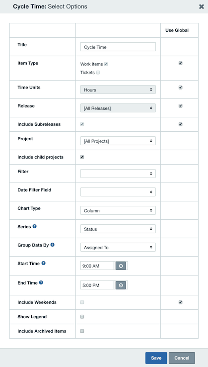
To group by different fields select the option under Group Data By. The Start Time and End Time are used to set your hours of business operation so that the chart aggregates the most accurate averages.
Flow gadget
Axosoft offers cumulative flow data via the Flow dashboard gadget. This allows you to review how many items stay in a given Status or Workflow Step over a period of time.
Each data point is logged at the end of each day in Axosoft, and the larger any shaded section gets over time then the more of a bottleneck this stage is becoming. That should help you and your team take action.
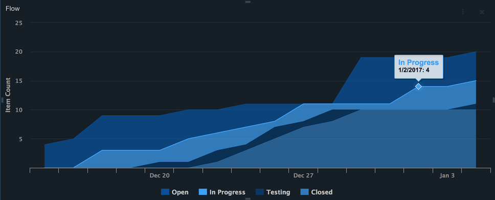
By clicking the ellipsis icon in the upper right of the flow diagram, you will be taken the Flow gadget settings seen below.
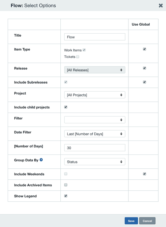
To group by different fields select the option under Group Data By. Select either the Status or Workflow Step option to determine which dataset to display. Be sure to also specify the [Number of Days] to define the period of time displayed in the gadget.
Global dashboard settings
Dashboard settings control the public access options and any global settings for gadgets.
To modify dashboard settings, hover over the dashboard toolbar, click the ellipsis icon, then select Dashboard Settings.
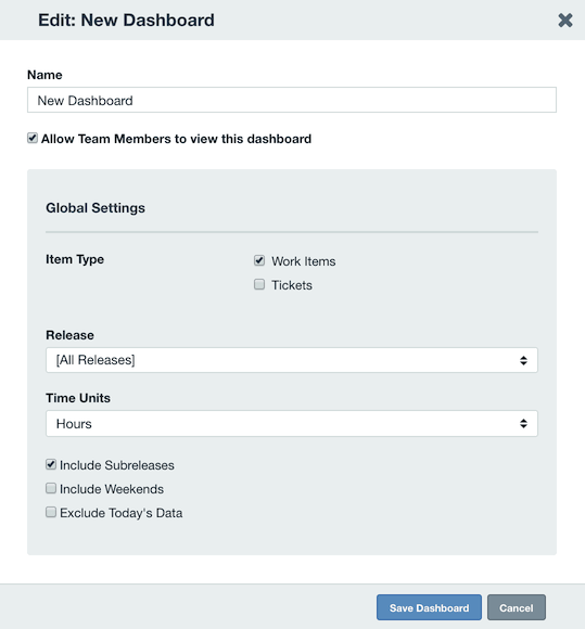
Global dashboard settings can be configured here to be used for gadget defaults.
When adding a gadget to the dashboard, 'Use Global Settings' can be used for fields including: Releases, Item Type, Time Units, and Day settings.
When enabled, the gadget can then dynamically show data refined to global dashboard settings.
Dashboard URL public access
In the dashboard settings, there is the option to make a dashboard public to only other team members and public to anyone with a shared link.
To create a public dashboard link, click the Create URL button to generate an address.
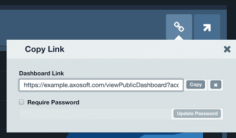
When enabled, click the Show Dashboard URL button or the hyperlink button on the main Dashboard Toolbar. This address can be shared or accessed without user authentication to share Axosoft data.
For additional protection, you can require a password for accessing the dashboard.
Important: Use of public URLs for dashboards will only be allowed while your Axosoft API is enabled. To enable the API, go to Tools System Options and click on Axosoft API Settings on the left.
Note: dashboard gadgets such as Twitter, which are subject to external authentication, will not be available for public dashboards.
Dashboard themes
Axosoft dashboards have both a dark and light theme. To update your dashboard's theme, click the gear in the upper left corner.
Note: The colors inside the dashboard gadgets are static and not configurable.